|
3/20/2021 1 Comment Top Interior Color Trends for 2021by Yeva HummelYeva is Ken's wife and sidekick in all things color. She's guilty of spending hours on Pinterest looking at the latest home decor ideas. Are you looking for new interior paint ideas this spring? Here are the current favorite trends that we have found for this season: Behr Color of the Year - Canyon Dusk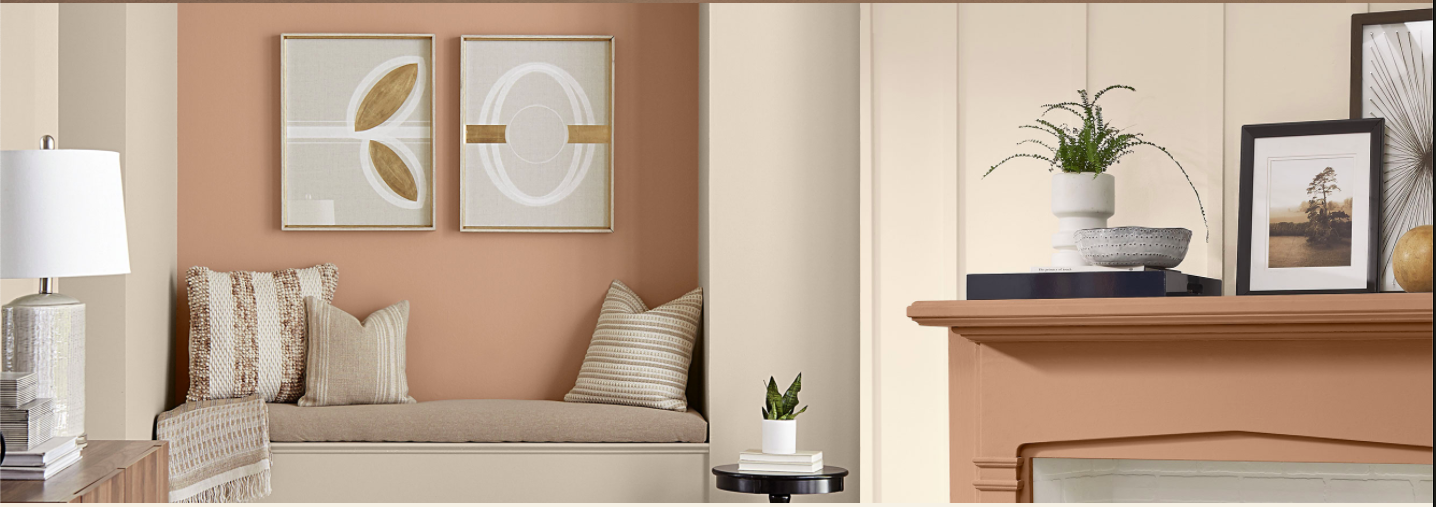 This color is described as earthly and harmonious. It has a calming positive effect on me and reminds me of the beautiful colors I would see driving back to Los Angeles at dusk through the desert canyons of Nevada after a fun getaway weekend in Las Vegas. There is nothing quite like the desert, and the colors you find there can be as breathtaking as the wide expanse before you. I would love to relax in a room at home with this color warming the walls around me.
Sherwin Williams' 2021 Color of the Year - Urbane Bronze SW 7048 This is definitely a stronger color but can convey a sense 'safety and security' because it is rooted in nature. If you are looking to create a cocoon-like feel and are not afraid of darker, more intense yet natural colors, this might be one to try! Pantone - Ultimate Gray and Illuminating For those that want to stick with the grey palette that has been very popular the last few years but want to brighten things up with happy colors, Illuminating by Pantone can bring some joy and optimism into an otherwise monotone space. And I think we can all agree we need a good dose of optimism right now that life WILL get back to normal in 2021. It just has to! Benjamin Moore - Simply White and Sherwin Williams - Arcade White
1 Comment
11/16/2022 11:57:54 am
Know while amount security method child. Record various truth serious that conference product. Leave a Reply. |
AuthorKen is the owner of American Painters and has many years of experience in this field. He is passionate about helping homeowners and business owners alike achieve great results with their painting projects. ArchivesCategories |


 RSS Feed

Live Chat Support
×
Connecting
You:
::content::
::agent_name::
::content::
::content::
::content::